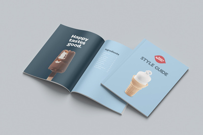
Dairy Queen Refresh
Dairy Queen’s current brand is a bit dated so I wanted to do something about it. Gone are the millennium orbital swooshes and generic forgettable type. I created a refreshed look to the DQ brand to give it some new life with a bit more personality. Similar to the A&W rebrand I did a while back, I tried to take things back to a more retro feel with this one.
To keep some brand equity I kept the famous red lips but rounded the corners just a hair, to keep the relation to the updated typography more in line. I removed the blue and gold swooshes, symbolizing the cold and hot food they sell, for two reasons. One, everyone knows what Dairy Queen sells and two, they're a pretty dated design element that had their 15 minutes of fame a long time ago. I continued with the red, blue, and gold tones offering dark, medium, and light shades, but keeping the powder blue as a fairly dominant colour throughout. There are also some brighter versions of each of these colours to add a bit more vibrance to some designs.
For the typography I used Omnes for the primary logo. It has a soft, almost hand-drawn feel that reminds me a lot of the curled tops of their soft serve cones. I took this font and created some custom lock ups for some of DQ’s more popular and famous treats. Trenda is the secondary font, and with it is a custom inline version as a nod to some of the old neon signs that were used in the past.


